Webex Brand Identity
The Visual System for All
-
Why rebrand
When the pandemic hit in 2020, that changed the workforce entirely to become more mobile and flexible. Cisco Webex has been Cisco’s video conferencing staple for the last decade. However, as a legacy tool of a big enterprise company, its brand impression is secure, yet pricy and not easy to use. Therefore, it was time for a change.
-
The change
This transformation is more than a rebranding. It is a global design language change that includes products, marketing collaboration, and even the company name. We want to ensure our dedication to a simple, delightful user experience is clear in every interaction our customers have with us.
The power of inclusivity
Our approach is to create an approachable, bold, and vibrant modern brand. The new design system is a framework, which is different from the guideline, without hard rules. It is flexible for designers/creators to play with it. The visuals should be built based on design principles and establish the thinking of inclusivity and connectedness Webex stands for and our commitment to leading the new era of hybrid work.

Design principles
-
A design foundation based on roundness and interlace of curve, suggesting an expression of humanity and collaboration.
-
An expression of energy and synergy through vibrant colors, gradient pairing, the weight of illustration, and typography.
-
A system open to all. Depictions of diversity across age, gender, body type, and ethnicity are paramount. Warm and welcoming colors and illustrations make users feel at home, and the highest accessibility standards are met.
-
A refined experience expressed through black and white high contrast, open composition, and layout transparency across the product and marketing experience. This ensures users can focus on what matters most.
-
A design system with built-in flexibility to allow individual expression through color choices and customizable elements.
Typography
A legacy of innovation
Cisco Sans TT is a key part of our brand. Its consistent usage promotes recognition and creates clarity. By introducing kerning changes, we bring a more compact appearance for adding personalities to the legacy font.

Composition
Applications


Iconography & Illustration
Simple. Modern. Approachable.
Marketing icons
Product icons
Illustration


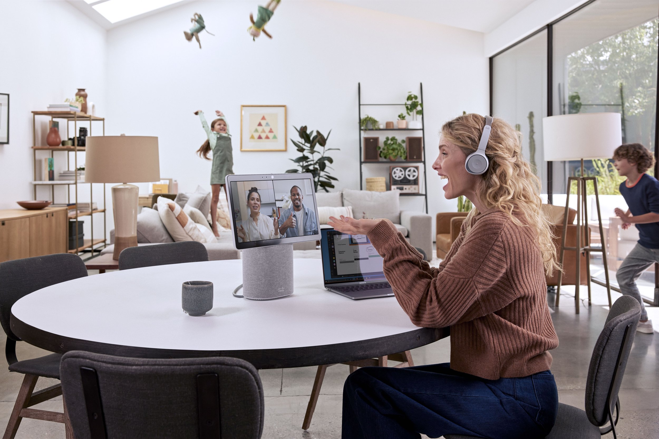
Lifestyle Photography
Capturing authentic, inviting, and lively moments.


Devices


Showcasing beautiful products in various ways.


Webex Design Studio
Creative Director
Koray Ekremoglu, Josh Gillick
Art Director
Irene Huang
Designers
Kelly Williams, Lily Liu, Brie Brewer,
Tony Nguyen, Colin Kent, Joe Lo
Creative Operation Manager
Kelsey Vilenchik
Agency
AKQA
BASIC
BULK
The Mill